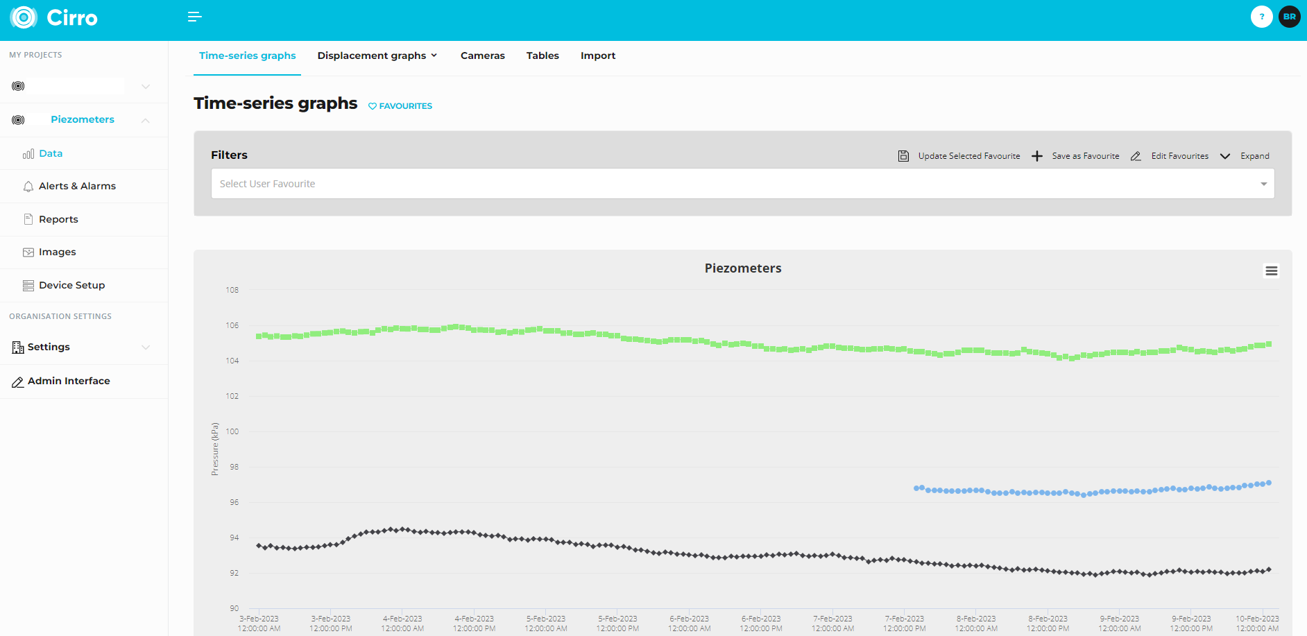
When you open the Time Series Graphs tab, you may already see some pre-configured graph views. These are called Favourites and can be accessed from the dropdown menu on the graph page, or from the 💙 Favourites page.
Creating a Custom Graph
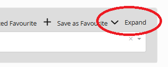
- Click the Expand icon (top of the page) to open the graphing tools.
- Select your datalogger(s) and date range.
- Assign Timestamp(s) to the X Axis, then select the schema you want to plot on the Y Axis.
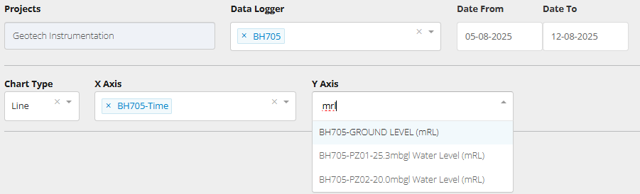
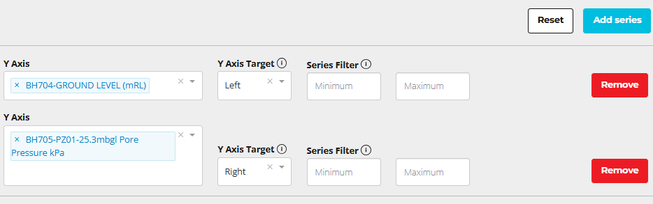
- Add multiple devices or schema on the same series, or click Add Series to plot additional device types on separate axes.
- Enter a Chart Title and label your X and Y axes.
- Click Search to generate the plot.
- Save it as a Favourite for future use (optional).
Advanced Graphing Tools
- Y Axis Target – Assign series to one of up to four axes (Left, Left Secondary, Right, Right Secondary). Helpful for plotting different data types together.
- Filtering – Exclude noisy or unwanted values by setting filters.
- Tip: If a filter affects multiple devices, place the device you want filtered onto its own series.
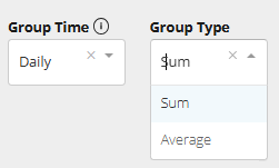
- Group Time / Group Type – Aggregate your data into larger intervals for easier interpretation.
- Group Time: choose to group by hourly, daily, weekly, or monthly intervals.
- Group Type: choose between Sum or Average.
- Sum – ideal for cumulative data such as rainfall (e.g., daily totals).
- Average – useful for smoothing out high-frequency data like temperature, pore pressure, so you can see trends without short-term noise.
- Vertical Scale – Untick Auto Scale to manually define a range. This can be useful if the alert lines are not visible in your graphs current view.
- Log Scale (X Axis) – Useful for datasets with early rapid changes followed by long periods of slow movement (e.g., settlement monitoring).
- Zoom - Click and drag a square on the graph to zoom in on that data/date range.
Export Data
If you want to export the underlying data, use the Export Data button.
- Cirro will generate a .CSV file for each schema plotted on your graph.
- The export reflects the data exactly as displayed on the graph:
- Any filters you’ve applied
- Any sum/average modifications
This makes it easy to extract processed data without needing to rebuild your filters or calculations outside of Cirro.
Note: The Tables tab also provides a way to export data. Use whichever option best suits your workflow
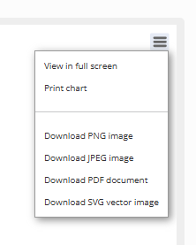
Exporting Graphs
You can export your plot by clicking the Hamburger icon at the top left of the graph. Supported formats include:
- PNG, JPEG, PDF, SVG (vector image)
Expand export options by clicking the hamburger icon: